This literally ruins Topbar+ experiences, but luckily we can choose to turn it off (at the moment)
Awful...
I sincerely hope that this stays in Beta until some huge changes are made.
Now when I say awful, I am not referring to the looks of the UI, the UI actually looks clean, however that’s where the praise ends since attempting to add anything developer-made to the game UI will ruin the view…
In short, there is just so much unnecessary space taken and the new TopBar's style doesn't seem like it allows for much creativity when it comes to a game's UI.
|
Please, in the future, give the developers more customizability of the TopBar in order to avoid these problems.
Some great customizability options would be:
-
Ability to actually organize the TopBar - For example: changing the corner where the buttons are located. This includes positioning the buttons on the bottom corners of the screen too.
-
Show/Hide the experience controls menu without disabling CoreGui - Currently it is impossible to hide it because the “Safety Icon” cannot be hidden. There are also cases where I would like to have some CoreGui enabled, but at the same time have the Expandable menu (and button) disabled. Unfortunately I am unable to achieve that because of how the menu is programmed.
|
Also the Safety Icon is a waste of space and should be removed. -
Different scales for the TopBar - Some games would really benefit in having a smaller TopBar and some would benefit in having a bigger TopBar. This TopBar just takes up a lot of space. Giving an option to have, for example, a 0.5x TopBar scale would benefit a lot of games and would give more UI space for the developer.
-
Changing the corners of the buttons - Also make it so that we can control the corners of the buttons, I am not the biggest fan of the new Huge circle with a huge Roblox Logo inside.
-
Changing the transparency of the TopBar buttons - Just like you were able to change the transparency of the actual TopBar bar back in the day, it would be great if nowadays you can change the transparency of a button’s background.
OR
-
Ability to style the TopBar buttons to your liking - This would allow the Developer to match the style of the topbar to the game’s style. When I say style I mean:
Everything I said in 3, 4, 5, and some additional properties such as the color of icons, color of the background, icons themselves, etc…
This would also make the whole process of UI designing way more future-proof.
Also, change the Experience controls button icon. What is that block (Unity Looking) icon supposed to represent?
6 Likes
It’s match with the Roblox icon left because it’s a Slanted version of. Another logoi read somewhere on the dev forum
This is getting concerning now. Now the topbar size changes from 48 to 58 on larger screens, but remains at 48 for mobile. I thought this whole update was made for consistency??
And dear god, PLEASE give us a way to disable this completely using SetCoreGuiEnabled. Myself and many other people like their UI in the top right corner, or fullscreen. Dont take that away from us.
I would like this update if the topbar filled the entire top side of the screen again, instead of floating buttons, because this is extremely hard to work with.
The lack of communication here is extremely concerning.
3 Likes
Hi Creators,
We’d like to share some valuable updates for experience controls. We want to 1) provide clarity on why updated experience controls are crucial for you and our users, 2) highlight your concerns and what we are doing to address them, 3) share next steps on how we are rolling them out to users, and 4) introduce a new top bar inset to help with UI design.
1) A reminder on why we’re updating experience controls
To progress towards our vision of reimagining how people come together on Roblox, we need intuitive experience controls that make incorporating platform level features easy for creators and intuitive for our users.
How do the updated experience controls help this vision?
-
Easy access to frequently used actions: We want to avoid interrupting a user’s in-experience session for frequently used in-experience controls (report abuse, mic and camera controls, self view). Users need a clear understanding that these frequently used in-experience actions will be available in a consistent location via the new experience controls in the upper right corner of the screen.
-
UI that scales to new future actions: The current UI is not flexible enough to seamlessly support new features and controls. For example, currently, when users access their device microphone and/or camera controls through icons placed above their avatar’s head, it obstructs their experience and breaks the immersion within the experience. As we continue to add more innovative ways for users to interact with your experience, like self view, the new experience controls give users a consistent, scalable way to access these actions without taking more screen real estate from your experience UI.
This also includes the future possibility of adding experience-specific actions that you create, as well as new Roblox UI elements and Developer Modules. Placing your experience-specific actions into the updated experience controls will help keep your UI clean and users immersed in your experience.
-
Clean separation of experience and Roblox actions: This separation creates a predictable way for users to find these actions and additional features we may add in the future. Experience controls on the upper right will show actions that are contextual and relevant while immersed in-experience (e.g. self view). The Roblox menu on the upper left for fullscreen platform controls (e.g. settings) will allow Roblox-wide actions.
2) What we heard directly from you
Since our last post, we’ve gathered insights from the creators, perception surveys, RDC, and DevForum comments to fine-tune our understanding. Here’s a snapshot of the collective sentiment:
Positives:
- Modern Look: The updated UI looks clean, especially its suitability for mobile
- Less Clutter: Removal of mic and camera toggles above the avatar widely appreciated
- Ease of Transition: The APIs will help you adjust your in-experience UI around the updated experience controls and Roblox menu.
- Clear separation of actions: You told us that you appreciate the clear difference between the UI for in-experience actions on the right side and Roblox actions on the left side of the screen.
- Positive Impact: 88% of you told us that the new controls would have a neutral to positive effect on your experience
Concerns:
-
Customization: You asked for more ways to customize the experience controls. This is where we heard the most concern so we’d like to address each of them.
- Hiding the controls: We believe these actions should be easily accessible to users at all times, especially abuse reporting and mic/camera controls. This gives them confidence in their safety, comfort, and privacy while using Roblox, and that confidence will increase their enjoyment in your experiences.
-
Moving to the left: Some of you told us that you wanted all Roblox UI on the left so you could have all space on the right. However, we believe there are several benefits to keeping the experience controls on the right:
- We’re using the same space as the three-dot menu that many experiences use today to give access to the leaderboard, inventory, and emotes menu. Users will be able to find these common features where they expect them.
- The right side has better ergonomics for frequently used actions; for most users, access under their right thumb is very easy and efficient.
- Finally, the spatial separation helps reinforce the mental model for users on the difference between in-experience actions on the right side and Roblox actions on the left side of the screen.
-
Increased Height: We heard questions as to why we expanded the Roblox reserved space from 36 to 58 pixels. It was noted that this feels too tall and could block existing in-experience UI.
- The increased height follows the best accessibility practices for tap targets; this will make it easier for users to find and tap their intended action.
-
APIs to adjust experience UI: 69% of you weren’t aware of the supporting APIs we’ve introduced, and 48% of you are less comfortable navigating ScreenGUI and want more help.
- We’re introducing a new inset tool, “TopbarSafeInsets”, to make it easier to adjust your experience UI. See below for details.
We’re continuing to think of new ways to make adjusting your UI even easier. Please share your suggestions!
Other fixes:
- Fixed a bug where the signal API returned “zero” for the existing UI.
- Made tooltips clearer and fixed overlap.
- Fixed blurry Roblox menu icon.
- Fixed the bug where the chat icon still appears even if chat was disabled with SetCoreGuiEnabled.
3) Next steps for upcoming user testing
We’re invested in bringing updated experience controls to everyone on the platform. On October 23rd, we’re starting that journey by releasing updated experience controls to a small percentage of users. This is an important step to gather feedback from users to make sure that we ship the best design for both our users and creators.
What does this mean for you?
- If you made a design change to your UI using the experience controls API, users will now see those changes without obstruction with updated experience controls
- If you have yet to make a design change and your UI is in the Roblox reserved space, some users may see your UI overlap with the new experience controls
What do you need to do to ensure there is no UI overlap?
We encourage you to use the signal API and the new inset API that are now available across Roblox client and Studio.
4) Introducing a new top bar inset
To make it easier for you to design your experience UI in a way that is compatible with the Roblox reserved space, we are introducing a new, predefined value for ScreenInsets called “TopbarSafeInsets”
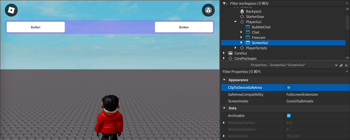
What is the new inset?
TopbarSafeInsets is a new inset type, with a predefined value, that we are adding to the ScreenInsets property available on ScreenGui instances. It will automatically resize to the available space in the top bar. The inset is designed to work across all screen orientations. This should make it easy for you to migrate existing UI that you have in this space and create responsive layouts.
The signal API and the new inset API are now available across Roblox client and Studio, working for both old and new Roblox UI to create adaptable and responsive UI. For more details on how to use them, see TopbarSafeInsets here and signal API here.
We’re on a journey to reimagine how people come together on Roblox. Thank you for your patience and understanding as we build simpler, scalable controls that will help us achieve this vision. Together, we’re creating a future to make it easier for tens of millions of people to come to Roblox to explore, play, learn, and connect with each other in 3D immersive digital experiences– all built by you.
We’ve also added additional FAQs below.
9 Likes
I get that you want important options like mic/camera to always be accessible. But this is not always relevant to everyone.
If my experience disables all CoreGuiTypes, along with voice/camera, why do I still need to have the right-corner menu visible? At that point, the only available option would be the report button.

And what if my experience is singleplayer? The report button’s only purpose would be to report the experience itself, since there would be no other players to report. Why would I want this much attention drawn to just reporting my own experience?
Clicking the right-corner button and then the report button takes two clicks. Clicking the left-corner Roblox button and then “Report” also takes two clicks. This just feels so unnecessary to have here, and it completely ruins any custom top-right-corner UI.
Also, not super important but I just realized that there’s no longer any indication that . opens the emotes menu. This should probably be added to the help screen in the Roblox menu at least.
On another note, I’d really love if we could just customize the topbar inset to something less than 58 pixels (or even directly re-position the Roblox button) instead of forcing us to sacrifice so much room for topbar UI. But I doubt anything like this will ever happen…
8 Likes
Im sorry but having no option to disable/hide the right side menu is absolutely not it and is pushing it too far (especially considering the fact that the menu is now insanely big).
Im against people providing non constructive criticism, and personally i think the new controls ui looks good visually, but valid feedback has just been blatantly dismissed with very vague and generic answers (which seem more like excuses), which is unfortunate and disappointing.
Please give is the option to hide it as its VERY obstructive, and also backwards since preferably developers do not want any roblox coreui on their screens if possible. Id like to see an option to hide the right side menu completely, as well as an option to somehow minimize the left side roblox icon.
also, what is going on with the new escape menu? its does not look up to standards, no offence, and lacks consistency.
3 Likes
While I appreciate that you acknowledge the feedback, I dont appreciate that youre doing nothing to fix it.
But why not? After disabling all the core gui, the only button remaining is for reporting, which already exists in the escape menu. Its just taking up space for no apparent reason.
How do I make this UI look good now:
With IgnoreGuiInsets set to true, like its always been:

Cant do that anymore because of the controls button.
With CoreGuiSafeInsets:
The empty space above the titlebar looks dumb.
Im sure a lot of people have the same issue now.
Why is the inset 58 pixels on bigger screens:
![]()
But its 52 on smaller ones:
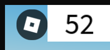
The actual size of the buttons doesnt change, so why not just keep it at 52? (or lower?)
Okay this is pretty nice though. Would also be cool to have a bool for when the controls menu is expanded, so we can hide ui when its expanded.
5 Likes
You need to design, create and stick with CoreGui which will allow you to create new platform level features and which will allow us (developers) to create future-proof UI. With recent bad decisions on Roblox’s end, I forced to rethink my whole way of creating future-proof games, and especially with this, future-proof UI.
I have a feeling that this number might be inflated a bit. I feel this way because (in my eyes) a huge amount of Roblox games don’t have well designed, well made UI (or some games which don’t even have custom UI).
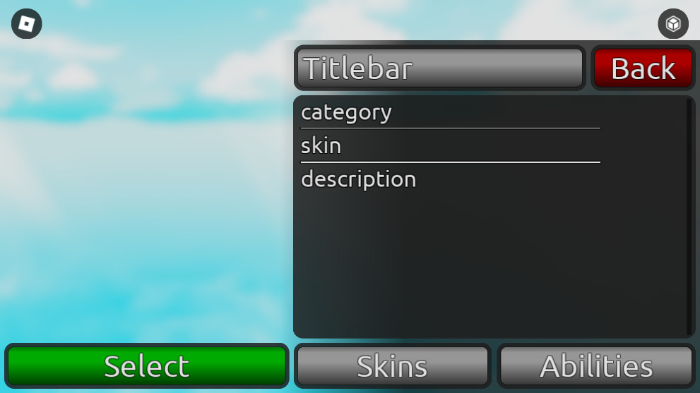
For example (below), what am I supposed to do in this case, how could I easily adapt to the new UI with this UI which has been specifically made with the previous TopBar style in mind? I now need to fully redesign this current UI in order to make it work with this update.
(Thankfully this isn’t a published game so I don’t have any real need to use or update this UI)

(About the report section) While it is understandable what you’re trying to achieve, what is stopping the user from clicking the SettingsSheild icon and navigating to the report section? It is still 2 clicks in order to report somebody or something either way. The report button is just unnecessary, when we already have 2 (or more) ways to report something or somebody (SettingsShield report section and default leaderboard Report button).
On top of the Roblox reserved space enlargement, you are also forcing the Abuse Report button (and by that, forcing the whole right side menu), which is just too much. You are majorly breaking immersion in games which want as less CoreGui as possible and you are adding yet another restriction to creativity when it comes to game development on Roblox.
I still urge to you thing about:
And while great changes were made, I still stand by what I said earlier…
7 Likes
I used to hold the opinion of wanting the ability to hide the topbar UI completely, but it makes sense not to do so for the reasons provided. However, this UI can look somewhat intrusive in some experiences. As a compromise, why should we not have the ability to let at least the topbar UI be optionally half-transparent faded when it is not active? For example, when you hover over the topbar or press esc it will unfade. The fade behavior will be toggleable and by default off.
EDIT: It can be intrusive in games where immersion is desired. The core topbar UI can kill that immersion for, for example, horror experiences.
EDIT 2: There could also be a client setting that overrides the fade behavior to make it not fade in the esc settings menu. Maybe this setting could be forced ON for users under 13 and toggleable for users age 13+ or even 17+.
2 Likes
Why can’t they just remove the 9 dots?
Think about it. We don’t need emotes. Plus, there’s a keybind for the backpack, leaderstats, and chat. On mobile, the chat button would be the three dots menu.
1 Like
Why haven’t they made a Dev Module that let us create future-proof Topbar buttons so we don’t have to rely on third-party resources like TopbarPlus or UIShelf?
A new future-proof Dev Module that does let us create buttons for the Topbar and if Roblox ever updates the Topbar (again), Roblox should update the Dev Module themselves so we don’t have to manually update the buttons to make it look like the new buttons in the Topbar. I need this kind of thing please.
Also I would like to bump this post below
2 Likes
This is a simple prototype for some custom UI I was experimenting with. It nicely blends the Roblox button into it with some clever tricks, without breaking immersion.

But I really don’t know how I’m supposed to work with this:

9 Likes
I’m sorry but this doesn’t help at all. All it is doing is reiterating the post
2 Likes
Love and appreciate the spirit of this reply, we want to see more responses like this.
WRT this, I do not agree. There are many situations where having a big button in the corner 100% of the time is not useful and not appreciated: e.g. cutscenes, top-to-bottom menus especially.
If the developer wants to create a bad user experience by hiding this button during the majority of gameplay, that’s their problem. They will suffer the consequences of that themselves.
7 Likes
I appreciate the transparency but you guys look like you are doing serious mental gymnastics about this right side/left side divide. The sentiment here and elsewhere has been anywhere between neutral to resoundingly universally negative as far as I have seen, including in all focus groups and other feedback sessions I have personally attended.
I am very sceptical of the interpretation that has been provided here. I am sceptical of the benefit it provides users, and I am sceptical that it is worth the multitude of problems it creates - especially for experiences dependent on minimising the presence of core UI.
Please justify your working. Where are these statistics coming from? It means nothing when the methodology is hidden.
17 Likes
FWIW we are a community of developers, not players. Players may overwhelmingly prefer it on the right, and we wouldn’t know that, at least not without transparency on the stats Roblox has collected, which is something we’ve been asking for in general on several changes for a while.
I personally understand the justification for it and while it’s a little gross, I’ll tolerate and work around it as I have for the last 6+ years.
For what it’s worth, I do not understand the justification for it at all. Let me explain my reasoning as comprehensively as possible:
Separation of ‘immersive’ / ‘non-immersive’ controls
Roblox broke their own paradigm here by including the Report menu under the ‘immersive’ menu, which kicks you out to the very same Settings menu that they seem otherwise allergic to linking under the collapsible menu. Obviously the inclusion of Report is justified here by other pragmatic concerns, but doesn’t that point to this being unimportant as a point? It clearly does not win out over ergonomics, space efficiency concerns, or immediate access concerns, so I’m confused why it is included at all.
On top of this, I hardly expect users to even think about the correlation - does Roblox have user studies or other data to back up the assertion that users can make this connection, and that they find this property useful? If they do, why not show that information as justification? I would suspect most users actually think of it as a quick access menu, which is to do with timing, not immersion, so I do not agree with this line of reasoning as a whole and don’t see why it should be such a pivotal point in the conversation - it sounds like the project manager’s personal line in the sand rather than anything motivated by actual user experience.
Ergonomics
Roblox’s stated justification is that the left thumb is most often occupied by the movement joystick on mobile. The right thumb, meanwhile, is used for invoking more sporadic actions such as jumping, and is therefore less commonly utilised.
Roblox use this as if it is a decisive justification for making the right thumb responsible for using this interface element. Implicit in this is the assumption that this UI element is so important that the user will want to multi-task and invoke this UI while processing other heavy cognitive loads such as moving around the game world and performing other in-game actions. This seems to me at best a stretch considering the options in the menu itself. Reporting users will not be commonly done simultaneously to focused in-game interaction. Neither will opening a view of your avatar, nor opening the chat window, nor viewing the leaderboard, nor emoting. I have conviction when I say this because, drawing from my own experience as a UX designer, I know that users, especially mobile users, do not multitask except in very specific and contrived scenarios, such as orchestrating a tightly rehearsed set of actions for a fast paced game. Most Roblox games do not incorporate time pressure of that nature, so users will almost never find themselves doing this.
What I would instead suspect user testing to show, would be that mobile users prefer to invoke these core UI actions while not actively doing something else in the meantime. If you are completing an obby, you will not try to do lava jumps at the same time as opening and reading chat, because your focus is elsewhere. Therefore, I believe this discredits the idea that using the right thumb is necessary for this UI to function well. There is no ergonomic downside to switching these functions to the left thumb - it only means that the left thumb will have to be lifted from its previous action to perform the next action, which from all of my lived experience is what mobile users will do anyway.
This is all not even mentioning the elephant in the room here, which is that phone users are a tiny portion of the Roblox user base. Tablets are the dominant form factor, for which these ergonomics arguments make less sense because - especially for a child with small hands - you will be more actively manipulating the posture you are holding the device with in order to reach the buttons at the top of the screen, which therefore makes using any of these buttons at all a more distracting endeavour by default, reducing the multi-tasking value of two-handed usage.
Beyond tablets, there hasn’t even been a whisper about the desktop user base, who remain a significant portion of the overall user base and have historically been shown to be the most sensitive to the nuances of updates.
It’s typical for desktop users to be on monitors of at least 1080p resolution. By artificially separating out the UI to two different corners of the screen horizontally, desktop users now have to travel that full distance if they are moving between the chat window and chat button, which I would wager are the two highest-traffic areas of the core UI. This is actively unergonomic and breaks key proximity principles of good design.
The problem is ridiculously amplified the more mature/power user you go, as higher-end players use higher resolution screens that worsen the problem dramatically. On my own screen, the button and the window are over 3000 pixels apart. That no consideration has been made for desktop users in light of these points is, in my eyes, a glaring oversight, and the fact the follow-up doesn’t even mention this is indicative that desktop is being left out of these design conversations, supported as an afterthought rather than as the culmination of a targeted design process.
Immediate access to controls
This is a point I actually agree with. It makes complete sense to be able to quickly report users, enable mic and camera, open chat, et cetera. This is one of the only points I’m willing to accept wholly.
However, I’m confused why this excludes other designs. Even if all of the controls were to be consolidated on the left, there would be no reason why you could not still immediately access chat, reporting, and mic options in exactly the same number of taps or clicks as before. The only change would be that the lower-traffic Settings screen would not be immediately accessible, requiring that you first open the toolbar to access it. If having control accessibility correlate with usage frequency is so important, why break step for this underutilised option?
It’s inconsistent and sloppy logic that I ultimately cannot agree with.
Loss of valuable space on mobile
This hasn’t been addressed at all here. No assurances have been given by the team.
There are good reasons to improve the mobile UI. I fully support having a better portrait mode core UI, I fully support modernising the design and making sure touch targets are large enough. What I do not agree with is that these changes necessitate such a large land grab by the core UI.
Game UIs already avoid the top-left corner with good clearance, because that is where the existing button is. Games expect the top-right corner to remain free and unobstructed, especially when they request minimal core UI, because real estate on phones is extremely limited elsewhere:
- Chat window and core UI lives in the top left
- The bottom left houses the thumbstick
- The backpack row lives along the bottom edge
- Jump and contextual buttons live in the bottom right
- Health and player list live in the top right
There is barely any room to go around, and any UI developer who has ever built for mobile knows exactly this pain. We often intentionally and pragmatically disable and redesign UI all of the time to try and fit everything in.
If Roblox were to merely increase the size of the Roblox button, I doubt this would send many, if any, games into sheer chaos by taking up valuable real estate. Since the entire menu can collapse down to a button of that size, this would not be a problem at all.
What actively would be a problem is taking up previously-promised-free space in a scenario where there is nowhere else for that UI to spill out to. We now either have to unanchor our UIs from the side of the screen (which results in a horribly unsightly margin), vertically compress it (where it is already vertically constrained and it is difficult enough to show enough content) or completely rethink how we are allocating space in general (which should never be mandated platform-wide like this because it is non-trivial to do). Do the prior flimsy justifications really justify this?
I will now throw away all pretense of being some objective viewer on this situation. I would like to talk about a pattern I recognise from previous years where I have interacted with teams who have been unable or unwilling to properly listen to users (and who on occasion have even been cheeky enough to imply that they have the support of them).
I will not mince words. This looks like a baseless, arbitrary, perhaps even petty rejection of the feedback that has already so clearly been given. The follow-up answers none of these concerns, instead choosing to re-iterate what we were already told while not even indicating that any of the actual feedback was sufficiently taken on board or discussed. This feels like talking to a brick wall and it is exactly the sort of behaviour that we criticise other teams for all of the time.
I have no confidence that this feedback will be taken on board because we have been presented with an identical product, with identical reasoning, to supposedly address feedback that has remained unaddressed.
42 Likes
How do I get the padding from the top of the screen of the topbar? I’m trying to add a button that blends in seamlessly with the new topbar but the padding is different between mobile and desktop (from testing using the emulator).
On the UI that I’m working on, the button looks fine on phone (IPhone X):

But on desktop the padding is bigger, so it is no longer aligned:

3 Likes
OH! I get it now. I’m supposed to position it at {x, x, 1, -2} with an anchorpoint of (x, 1). The bounds of the ScreenGui encompasses the free space of topbar itself, and the buttons are positioned relative to the bottom of the bounds.
2 Likes