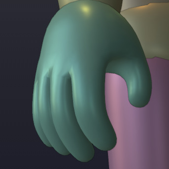
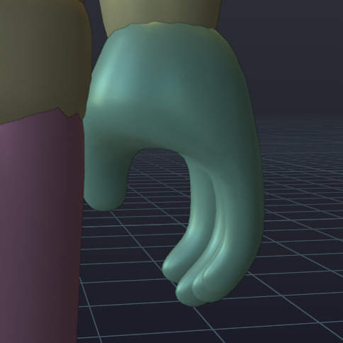
I tried using masks again
Y’know, I’ve been looking at the custom character model I made late last October and I’m realizing I should’ve made more adjustments to its hands and feet/shoes before exporting them.

I originally made its feet very thin near their ends because I wanted to layer larger shoe meshes over these eventually. By themselves, these meshes just look weird, though. I’m going to make them taller and shape them more like packed snow rather than a vague “foot” shape. This will make it impossible to represent bare feet, but I could always do what Royale High does and hide these foot meshes if I needed to add uncanny-looking, out of place toes for specific shoes, anyways… (I think that looks weird in that game anyways, so I don’t really care about adding feet to my experience anyways.)
As for the hands, they’re also weird, but you only really notice their strange shape when you look closely at them (especially in VR when they’re in front of your eyes)! One of the main strange things about these hand meshes is how “fanned out” the fingers are. If you tried to imitate this “hand pose” in real life, your fingers would curve more towards the middle horizontally, so I’ve slightly adjusted their angling.
(Their proportions are still incorrect, though; Your pinky finger isn’t the length of your index finger, and each finger’s a different width…)
I was also considering trying to edit the torso parts, so the lower torso would affect more of that part of the body and look “smoother” instead of the upper torso bending over 75% of the whole torso, but once I looked at my current character model and thought about the R15 textures, I realized I couldn’t actually improve that. (Roblox needs to add an R16 model that splits the torso into three parts; I would probably use that.)
EDIT:
I wish I would’ve waited until now to share screenshots of the “improved hand”. I’ve adjusted the fingers’ lengths/widths and added more divisions to give the hands a better shape.


Started working on new sprites. Development’s gotten to a point where I kind of need them.
![]()
Behold! Boolit!
Making an open world space sandbox game with about 9 other people, development is going great so far and we’ve amassed a community of around 100 users waiting for the game to release. We’ve projected at least 2-3 months before a pre-alpha release.
(Image above is actual footage of gameplay, please note that nothing is final and everything is subject to change.)
This is actually pretty cool! I love the models too!
Well, anyone who’s been checking out my posts in this topic definitely wouldn’t have seen this coming, but Project Magical Mary is now using a new loading screen! It stays during teleports, and has better animations than the older one! The player’s avatar poses on a 3D platform, giving them something to look at while the client generates its local character entry, waits for the server to load the player’s save data, then the client pre-loads some “important” assets.
I tried to make it look as “smooth” as I could; Do you think the new loading screen looks good?
A more general purpose derivative of Tabby, but also makes the syntax easier to grasp.
local cat = Catwork.Fragment {
  Name = "CatGenerator",
  Cats = {}

  Init = function(self)
    while true do
      table.insert(self.Cats, generateNewCat())
      task.wait(1)
    end
  end

  GetNumberOfCats = function(self)
    return #self.Cats
  end
}
I actually started this in December but having a few roadblocks with Luau’s typing system, esp on Fragment generation.
meow ![]()
The character in the loading screen, isn’t moving. You can see the bricks change at 3 seconds. And the blue text could be a bit higher up, not that close to the loading bar. But yes, it looks better than what I could do. Do you actually intend to release this game? Or is it just a project for you to do?
Well 1 month in and my game is actually quite a lot of players.looking to expand the storyline and making it bigger than it is at the current moment
I’m currently still working on my European Railway simulator. I don’t have the time to explain everything in full detail so you guys can check out more information here A showcase of my current works
I am solo developing it (PAINFULLY) but it will be released!
That has to be inspired by Miami right? Is it Ocean Drive?
That’s intentional; Nothing can move while the client is teleporting between places, so the player’s character is posed then anchored before the loading screen appears, to make sure it doesn’t disappear after the glitchy flickering shown in the video.
I’m not sure why that’s happening; I just checked both places and they’re using the 2022 materials and no material overrides are specified.
I’ll consider moving that text, if I remember to continue modifying the new loading screen.
Though it’s mostly just a very slowly-developed personal project at the moment, I want to release it eventually…but I think I’ll have to begin focusing on gameplay, one of the more boring things to think about implementing, before I can do that.
Char. Model Update
And here’s today’s update: those new hand and foot meshes have been finished, and they’re now in Roblox Studio!
The hands were the more tedious mesh to edit, since hands are always one of the trickiest parts of the human body to both draw and model! The new hands have more accurate finger lengths and widths, and there’s less spacing between each finger, which was the primary reason why the old hands looked so strange.

As for the feet, I abandoned the more specific “barefoot” (or very thin shoe) shape and just went for a more abstract, boxy blob, which comes off as more of a shoe than the old mesh, interestingly enough.


I hope everyone likes these changes; I know there are more issues with the character model but they either can’t be fixed without messing up the joints (legs and arms) or might cause the model to not resemble a Roblox character (mainly the head).
If anyone preferred the old hands or feet, don’t worry; If I release this as a resource later, I’ll try to include both versions of the character model, in both RBXM and source (Blender) formats.
EDIT: In case anyone is curious, I released the character model as a community resource.
Working on my game inspired in games like Vampire Survivors, Brotato, etc.
It’s called Monster Slayer
I’m working on this “Quantum Travel” concept for my game that’s inspired by build a boat. The sphere is so big because it’s meant to let a huge vehicle (200x200 studs) get transported on certain spots on the map. I was hugely inspired by Outer Wilds and its Quantum mechanic. You’ll know what I mean if you have played the game.
Look into the description for more (lorewise) info
It didn’t take too much work, but Project Magical Mary’s cute but “basic wand” has more potential now. How could it be capable of more? It looks like the same exact model! What changed about it?
Well, you see, this wand has a different structure to it now. Before, it used multiple parts just for Royale High-esque recoloring, but you would see the glitchy emptiness if you ripped it apart before. As of now…
…that has changed! The Basic Wand has been split into four pieces, the tip, rod, handle/grip, and pommel! Even if the wand fell apart (like it sadly had to do for this screenshot), you wouldn’t see inside of it because each part has been “capped” with smooth ends! (Meshes within pieces that still can’t be seen without another bordering it (such as the grip’s purple section) don’t have these additional polygons for optimization, however.
Why did I do this? Well, my teammate and I both thought of an idea that would really increase the customization and flexibility of wands! What if the player could mix and match different pieces to make their own personal wand, which could become part of their fashion, blending with their outfits? Well, the new “modular wand” meshes will make this a reality…soon ![]() .
.
EDIT: It’s already one step closer to replacing the original wand; As of February 6th, all four wand pieces now have attachments, and can be lined up using a function (which has existed for probably several months at this point)! I used it to assemble the pieces shown in the last image into a completed wand:
It may look like my cute wand mesh, which you’ve seen many times by now, but what you’re looking at now are the wand pieces, welded together with WeldConstraints and welded to my left hand with an invisible hand part.
Lastly, I just checked last year’s #waywoc topic and saw that I waited until this day to write my first post, while this is my eighth post this year. My brain might be in awful condition now, but I seem to be more ironically productive, if anything.


