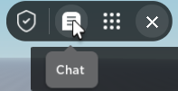
this is what i hate the most about new CoreGui, the chat toggle is placed in THE LEAST CONVINIENT PLACE A HUMAN COULD EVER IMAGINE.
4 Likes

2 Likes
The new roblox ui should be revoked, you can disable it in beta features.
even if they fix all the bugs and stuff, I’ll still dislike because it looks bad lol
7 Likes
This is true. As for why, he told me he’s taking time off from software development because of other interests that started working out. It is unknown on when he will come back.
1 Like
if you use Bloxstrap. you can enable this feature on the client
Bruh… This is even worse topbar… Keep it how it is.
2 Likes
I literally made a DevForum post about how I can make TopBarPlus look seamless with GUI because right now it looks awful together.
So this update released for some users already and it is less than ideal:
For simplicity, I will refer to the “cube icon’s” menu as the “collapsible” during this post.
Issues:
Yes, these should be filed as bug reports however I also want to address these here because in all honesty they will likely take months to be resolved as a bug report… Plus, these did make it into the production level code-base and are active right now. Who knows, maybe some of them are somehow intended?
-
Two beta badges?

Appears that both the “cube icon” and Roblox icon has received their own “beta” disclaimer, leading to overlap on the UI. -
Microphone icon just appears?
Can’t get a screenshot of this one but it appears that the microphone icon isn’t always present when first opening the collapsible, appears to occur randomly and when it does;the microphone icon will quickly jump into the collapsible after a small length of time of having it openEdit: it can take multiple minutes for it to appear sometimes. This appears to happen more frequently on your first time of opening the menu. -
Flickering emote icon?
The emote options will quickly disable and re-enable itself upon death; this appears to be done since your character does not exist at all for a short length of time during respawn, however this split flicker of the option is really annoying from a player’s POV.
“Features”:
These appear to be intentional design choices of the new CoreGui that I’m not too fond of…
-
The MRU
While I agree that there needs to be some way to hide the options that a player will not end up using, the current system seemingly doesn’t allow you to move options back so that they are solely in the MRU again. This is disappointing since once I select an option, it then gets permanently placed on my top bar with no way for me to remove it without re-joining. -
Report button
For context, I mean the “Report” button that places itself inside the collapsible; not the one in the Escape menu. It takes the exact same number of clicks to reach the report menu from the button in the collapsible as to the tab in the Escape menu! This means that the “Report” button being in the collapsible adds literally no purpose other than being an extra icon. It is also the only icon which can’t be removed under any circumstances which is annoying for UI-based experiences. Also, why do we need this to be a collapsible if there is only one option?

-
Massive gap on the leaderboard

Not sure if this is necessarily a bug so to be safe I’ll treat it as a feature for now. Because the “…” icon was removed, the player list is now misaligned as it still takes account for inset. Ideally we should be given the option to align it upwards, emphasis on the option here; we should not have it forced up as it may conflict with UI that some developers have placed in that area.


Don’t get me wrong, there are quite a few things that I do like about this update; for example, one being the addition of the microphone icon to the top bar. I also truly believe that the team behind this feature had developers’ best interests at heart while making it, which can be seen by the fact that many changes were made since this topic. (the button is on the left now! ![]() ) However, I do believe that in this case the feature just didn’t quite hit the mark unfortunately.
) However, I do believe that in this case the feature just didn’t quite hit the mark unfortunately. ![]()
12 Likes
whats going to happen to topbar plus
1 Like
I believe that they mentioned that they’re adding developer APIs in the future to add buttons to it, hence why the MRU exists but I agree with your point about moving or hiding them back (and it’ll only get worse when developer items get added)
Honestly, I don’t get why they keep breaking what isn’t broken.
I don’t mean to be this person but I remember when the hamburger coregui topbar was here and I honestly prefer that over all other new iterations we have gotten since.
I hate logos especially ugly-looking ones and constantly having one in the corner of my game as a giant watermark is just aggravating. Now, making that button larger and more ugly is just annoying.
3 Likes
Hey the link is not working is it still available?
Roblox recently made all links that used to point to the library (Basically old marketplace) to break and not work anymore thus it just redirects to the modern site making this link broken.
1 Like
The redirects to the create site should not break links. If you’re getting a dead link the referenced asset was likely deleted by the owner.
1 Like
This happens with offsale assets that haven’t been archived by the owner. Is this intended? The old library did not do this.
1 Like
It also seems to occur if the asset was not marked as Distribute to Marketplace. Is this part of the new asset privacy update?
This is literally my worst nightmare.
The menu UI is around quadruple the size as the last one, and is absolutely the worst pain ever to work with when making full screen UI’s inside of Roblox ![]() . I am convinced there hasn’t been a good update on roblox in around 2 years that was actually appreciated by the community.
. I am convinced there hasn’t been a good update on roblox in around 2 years that was actually appreciated by the community.

5 Likes
I am convinced Roblox wants to watermark our games on top of stealing 70% of revenue from us.
1 Like