Hello developers,
I am TheCarbyneUniverse and I really enjoy UI designing. So, today I am going to share my quick and easy techniques of positioning an sizing UIs with the community! Please keep in mind that this tutorial is mostly for beginners to UI, so the concepts covered in this are relatively basic.
1. Use Scale Instead of Offset
For those of you who do not know, there are two types of information needed when sizing and positioning UIs: scale and offset. The latter sizes/positions in pixels. For example, a size of {0, 200, 0, 50} would make that element 200 pixels wide and 50 pixels of height. The problem with this is that if you plan to make your game available to (pretty much) all devices, using offset means that your UIs’ sizes and positions are set in stone. They do not adjust based on screen size.
This is a frame that is
{0, 500, 0, 500} (500x500 px). Looks okay.
The same frame would look like this on IPhone 7 (very large).
And this is on XBox (very small).
If you do not want this to happen, then the solution is to simply use scale. Have you noticed how the first and the third numbers were zero in the sizes shown above? Well, those numbers are what control scale, which is measured in the percentage of the screen width/height but converted into decimal form.
For example, a frame that is 0.7, 0, 0.7, 0 size (no offset sizing, pure scale) means that that element takes up 70% of the screen in terms of width and height. The same concept is applied to positioning. If a button’s position is 0.3, 0, 0.6, 0, it is 30% of the screen to right and 60% of the screen down (relative to the top left corner of your screen, by default).
This is a frame that is
0.5, 0, 0.5, 0 size. Notice how, even though both the width and height is 0.5, it is larger horizontally than vertically. That is because most screens are like that: they are wider than they are tall.
2. Use UIAspectRatioConstraint and Other UI Modifiers
UIAspectRatioConstraint (I will refer to it as “ARC”) allows you to preserve your desired aspect ratio based on width or height.
Aspect ratio is a value that is resulted from dividing 2D element’s width by its height. Squares have an aspect ratio of 1, because all of their sides are equal in length. If you would like to use scale for sizing and positioning and you want your UI element to be of a certain aspect ratio, ARC can save the day! All you need to do for this to work is insert a UIAspectRatioConstraint inside of an element.
Setting the AspectRatio property to 1 on a frame will yield a square:
AspectType basically determines the boundaries of this scaling. If “FitsWithinMaxSize” is chosen, the element can be as large as you want, but “ScaleWithParentSize” makes sure the element never gets bigger than its parent.
DominantAxis is what this whole operation goes off of. By default, it is set to “Width”; which means you can control only the element’s width, and the height is automatically set to preserve the aspect ratio. And the inverse is true for “Height”; you can control the height of the UI object, and the width is calculated by Roblox.
There are many other UI modifiers just as useful as, but used less frequently than, ARC:
UIGridLayoutUIInlineLayoutUIListLayoutUIPaddingUIPageLayoutUIScaleUISizeConstraintUITableLayout
Consider clicking the links above, because these listed can be seriously useful in creating some common layouts.
3. Take Advantage of AnchorPoints
The AnchorPoint property of every UI object determines the basically the pivot point of it. It affects positioning, sizing, and rotation. By default, this is set to 0, 0 (on the top left corner of an element).
This point’s position is in percentages of the element, but in decimal form just like scale.
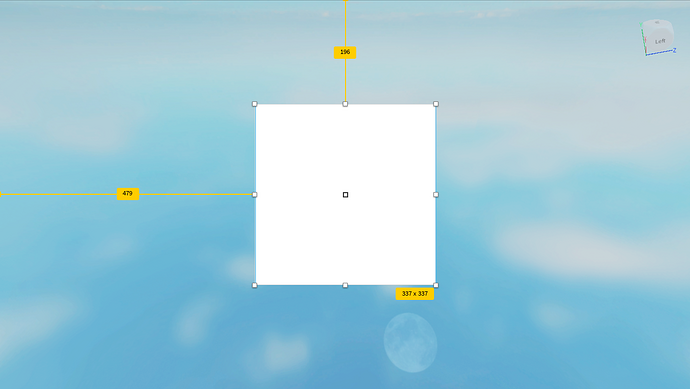
You can easily see the AnchorPoint if that object is selected:
Notice that little square in the center of the square. That is the
AnchorPoint.The reason why this one is in the middle is because I have set the property to
0.5, 0.5 (50% across and 50% down). This is a common value for AnchorPoint because this can easily help perfectly centering a UI element.
See the video below for the advantages of using the value 0.5, 0.5:
Notice how, even when I scale and rotate the frame, it always stays centered.
Say if you wanted to have the frame be all the way to the right, but still centered vertically. This is when you would use 1, 0.5 for the AnchorPoint. Also, you would set the position to 1, 0, 0.5, 0. This is just one example how you can be cleverly use this property to easily position UI elements!
Hopefully, you find this super useful or you learned something new. Feel free to post how you used to develop UIs before reading this and how this will help you.
Also, if anyone thinks they have a (better) technique for scaling and positioning for UIs and wants to share it, feel free to reply.
Additionally, please share your feedback on this topic:
Did you learn anything new from this topic (from the topic itself, the links, or etc.)?
- Yes
- No
0 voters
If so, are you going to incorporate these techniques into your development routine?
- Yes
- No
0 voters
Thank you for your time and vote,
and happy developing!


